COPY — VA Clinical Decision Support
Lung Cancer Screening
January 2022 thru December 2024
Client
U.S. Department of Veterans Affairs
My Role
Lead Product Designer
Scope
Research, UX/UI Design, Usability Testing, Iterative Prototyping on a cross-functional team consisting of research, design, and engineering
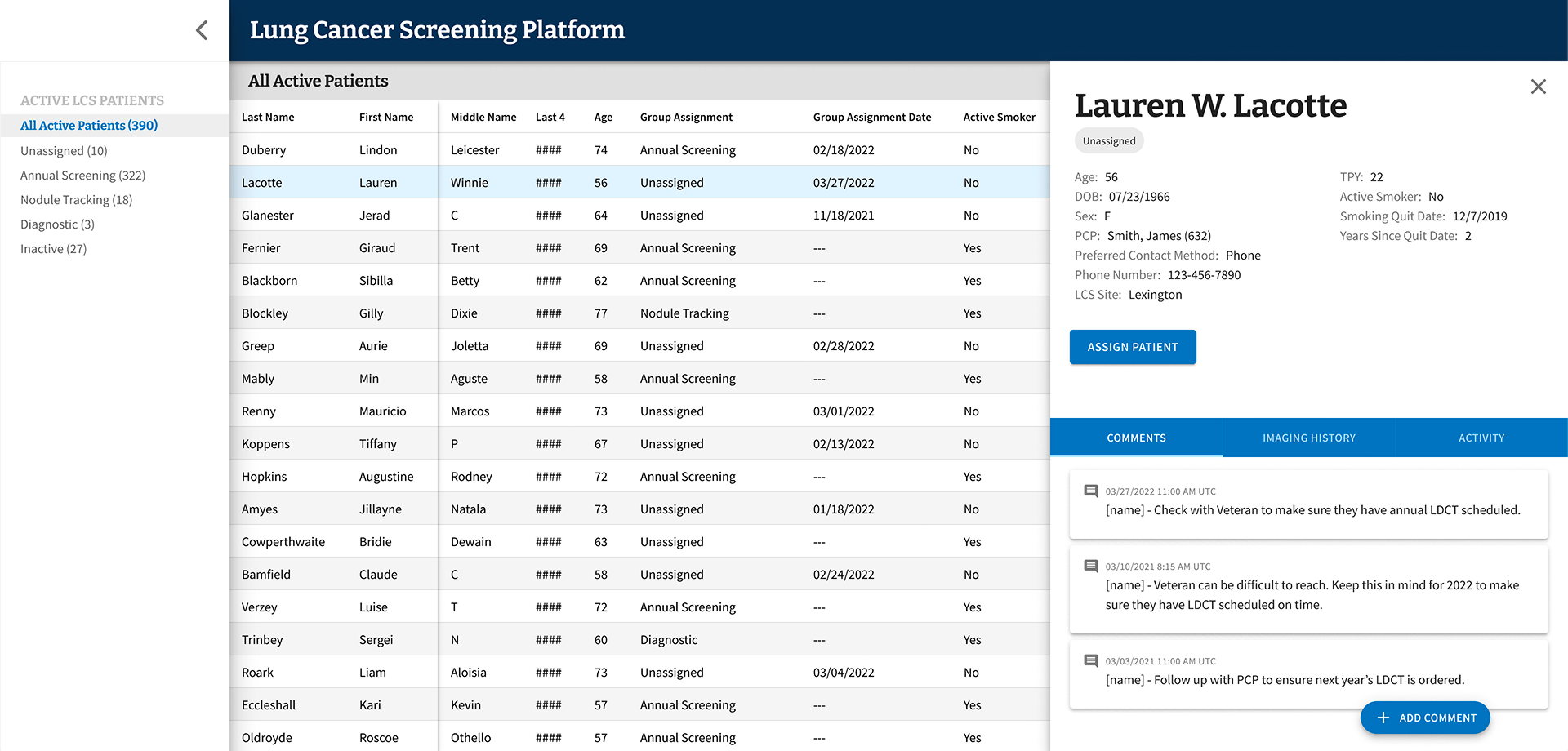
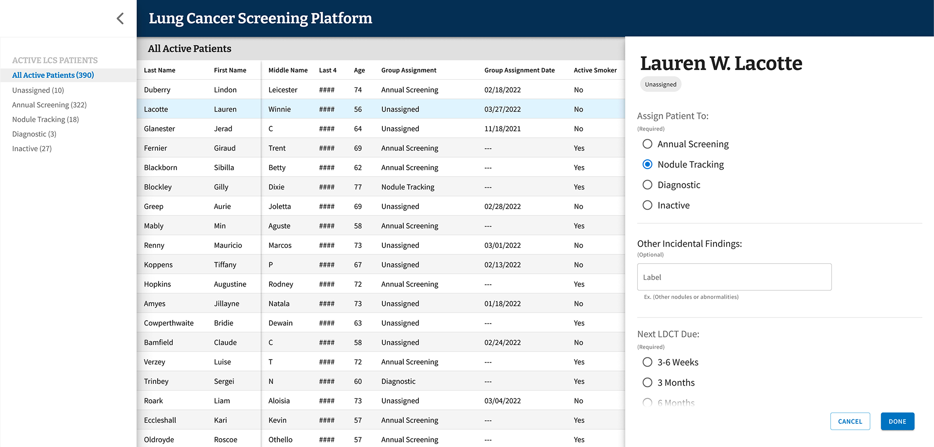
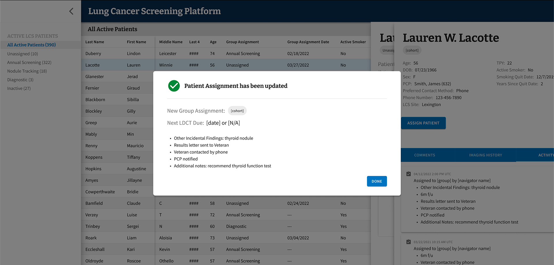
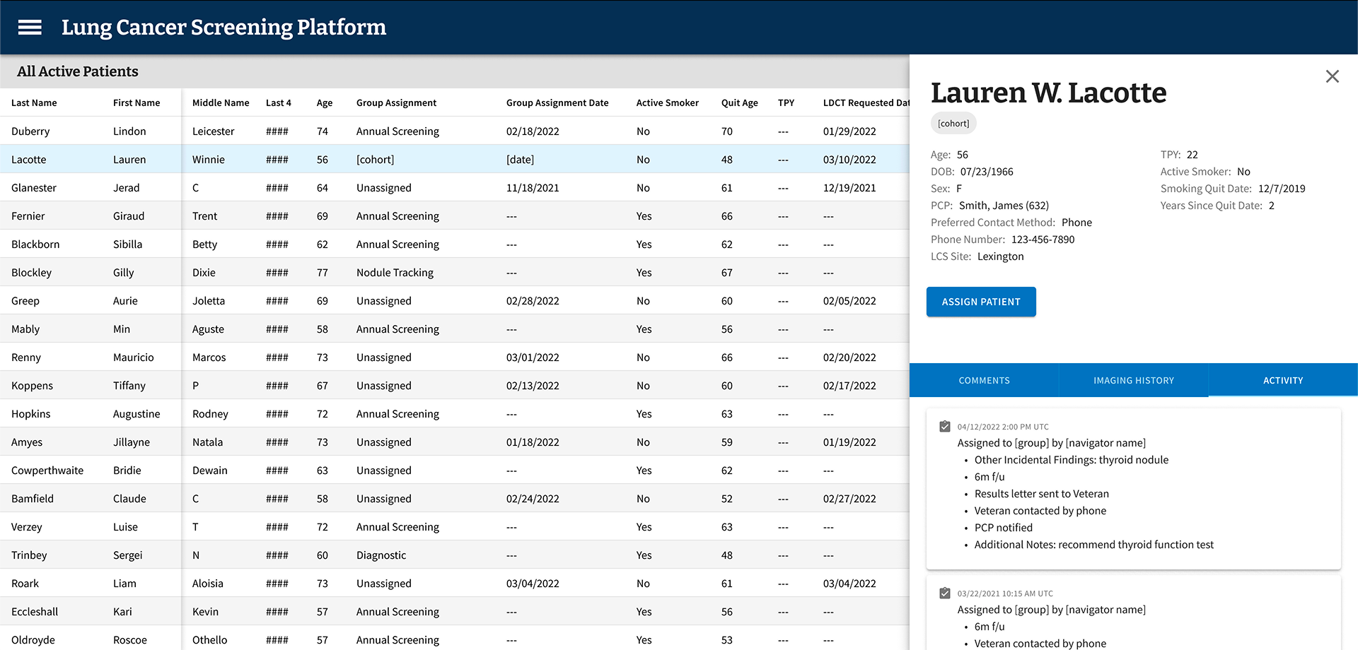
A screen from the Figma file for the minimum viable product (MVP) of LCSPv2. All data shown is mock data as expected to ensure no PII/PHI was ever used in prototypes.
Overview
I was part of the team that partnered with the VA to design and build LCSPv2, a next-generation Lung Cancer Screening Program application. Our mission was to replace a legacy tool that would soon be inaccessible after the VA's transition from CPRS/VistA (legacy EHR) to Cerner Millennium (enterprise EHR), and to do it in a way that genuinely worked better for the people using it every day: Lung Cancer Screening Coordinators.
Every year, nearly 8,000 Veterans are diagnosed with lung cancer through the VA healthcare system. By screening high-risk patients for lung cancer, the VA has the ability to find these cancers early and increase survival by 20%. With over 900,000 Veterans eligible for lung cancer screening, the stakes couldn't be higher — and the tools coordinators rely on needed to match that gravity.
The Problem
The existing tool — LCSPv1 — was built around the VA’s legacy EHR and wasn't going to survive the EHR transition. But beyond the technical urgency, we had a deeper challenge: we needed to understand what Coordinators actually needed from a tool like this, not just replicate what existed.
A broad view of the LCSP process, touchpoints, and the different roles involved.
A more specific view that show the LCS Coordinator process and touchpoints.
Flow diagram that visualizes the process for assigning patients into group cohorts.
Coordinators manage patients through a multi-year screening program that requires careful, consistent tracking of imaging results, patient cohort assignments, follow-up timelines, and clinical notes. Getting this wrong doesn't just create administrative headaches — it can directly impact patient outcomes.
Research & Discovery
We started with generative research — talking with Coordinators to understand how they worked, what frustrated them, and where their current tools fell short. One thing became clear quickly: while Coordinators shared common workflows, they had adapted significantly to their specific VA Medical Centers, often building workaround spreadsheets outside the EHR entirely.
Those grassroots solutions told us a lot. They weren't a sign of failure — they were evidence of real unmet needs.
Design System
Screenshot of several components and variants for the UI
Building a clinical tool meant design decisions had to account for how Coordinators actually work — dense information environments, minimal scrolling tolerance, and workflows that often rely on keyboard navigation over mouse input. These aren’t edge cases in a clinical setting; they’re the baseline expectations.
We chose MUI as our design system because it met that baseline out of the box. Its extensive component library and flexible theming gave us a strong foundation that mapped naturally to the demands of a data-heavy application — without the overhead of building from scratch. MUI’s components are compact by default, which aligned well with Coordinators’ need to see as much patient data on screen as possible at a glance.
Where MUI’s defaults didn’t fully cover the specific nature of LCSPv2, we used its theming and customization capabilities to build patterns tailored to the application — custom interactions, adapted layouts, and clinical-specific UI behaviors — all while staying within a consistent, maintainable system. The result was a UI that felt purpose-built for the work without requiring us to reinvent every component along the way.
The Hypothesis — and Why We Changed It
Our initial hypothesis was that giving Coordinators more fields to enter data upfront would speed up clinical decision-making downstream. More data in, faster decisions out. It made sense on paper.
Testing told a different story.
Screenshot from usability testing showing where participants provided feedback.
Coordinators found the extensive data entry redundant — they were already recording much of the same information in the EHR itself. Instead of streamlining their work, we'd added to it. The cognitive load was real, and it was slowing them down.
“You have to be a detective to dig through the data in different systems and tools to find all the information you need.”
–VA LCS Coordinator, on using LCSPv1
That quote stuck with me. One of the clearest goals we set for LCSPv2 was to eliminate that detective work entirely — consolidating what Coordinators needed into a single, coherent view rather than forcing them to stitch together information from disparate systems. It also reinforced our pivot away from exhaustive data entry: rather than building a comprehensive input tool, we focused on surfacing the highest-priority information that actually drove clinical decisions, all in one place.
Testing & Iteration
From there, I helped facilitate 25 one-on-one usability testing sessions with Coordinators who had one to three years of experience in the role, across diverse VA Medical Centers. Each session was structured around task-based scenarios, with a facilitator, silent note-taker, and participant.
Screenshot of Figma file from Usability Testing with synthesized feedback.
We documented observations in Figma and Google docs with all participant information de-identified.
We ran two-week usability testing sprints, iterating on the prototype after each round of synthesis. Working within an agile framework, the team reviewed and refined after each session — adjusting based on evidence, not assumptions.
After validating the revised direction through another round of testing, we moved into a beta release with a small group of core users before a broader rollout.
Final MVP patient assignment flow
-
On the first day of beta testing, our most closely collaborated user reached out to ask why none of the patients they had seen that day were showing up in LCSPv2. A simple question — but one that landed with real weight given everything that had led to that moment.
We had a known answer: a 24-hour data lag upstream, entirely outside our control, meant information didn’t arrive in our data repository until the following day. When we reminded them of this, their response reframed everything: “Well, then I can’t use this. I see my patients today — I chart them today. I can’t do today’s work tomorrow.”
This was someone we had worked with nearly daily for months. We had shadowed their workflows, mapped their jobs to be done, conducted usability testing, and spent weeks doing meticulous data validation together — because the standard every LCS Coordinator holds themselves to is clear: no Veteran should fall through the cracks. We had reached data parity and crossed our confidence threshold before launch. And still, this single nuance — when they actually did their charting — had never surfaced. Other coordinators we had worked with throughout the process didn’t chart same-day, so the behavior never registered as a variable worth capturing.
It wasn’t a failure of effort. It was something only the real environment could expose.
I brought a solution to the team. Rather than waiting for an LDCT order to change status to “complete” as our downstream trigger, I proposed pivoting to using the day’s scheduled appointments instead. We already had that data. Patients could appear in the tool same-day, giving the coordinator everything they needed to chart next steps immediately — without waiting for upstream systems to catch up. It was a workaround, but it was the right one.
The larger takeaway reshaped how I think about prototype-based usability testing. Prototypes are essential for validation — they surface confusion, sharpen flows, and build directional confidence. But they can’t fully replicate the texture of someone’s actual day: the timing, the rhythms, the small habits people don’t think to name because they’ve never had to. Live environment testing, with real systems and real data, surfaces a different and deeper class of insight. Not a replacement for what came before — but the next layer of truth.
Key Design Decisions
Reducing Scope to Increase Impact
We cut the required data inputs from over 100 fields down to under 20. The remaining fields focused on what actually drove clinical decisions:
Patient cohort categorization based on low-dose CT scan results
Date of scan
Supporting notes to improve accessibility and reliability of information
This wasn't just about simplifying the interface — it was about respecting Coordinators' time and cognitive bandwidth.
Designing for Variability Across VAMCs
As we expanded our research across VA Medical Centers, we saw just how much variation existed. Different program models, different team structures, different workflows. Rather than building custom solutions for each site, we introduced configurable features — like the ability to show or hide data fields within the patient grid — so Coordinators could adapt the tool to their context without needing engineering support.
Partnering Beyond the Screen
Good product design sometimes means looking beyond the product itself. Our research led us to partner with the Lung Cancer Screening National Office to identify process challenges across VAMCs, align on solution paths, and create standard documentation and implementation guidance. The tool was one part of a larger effort to improve consistency and quality across the program.
Outcomes
The results were meaningful — both in terms of measurable impact and the qualitative signal from Coordinators who finally had a tool that worked with them, not against them.
Reduced data entry from 100+ fields to under 20
Eliminated the supplemental spreadsheets Coordinators had been maintaining outside the EHR
Reduced cognitive burden and improved speed and accuracy of clinical decisions
Achieved full adoption across eligible sites
What I Took Away
This project reinforced something I come back to often: what users ask for and what they actually need aren't always the same thing. Coordinators told us they wanted more fields. Testing showed us that more was exactly the wrong direction. Doing the research, holding space for that kind of pivot, and making the case for a simpler product is some of the most important design work we can do.
It also reminded me how much context matters. The same role at two different VA Medical Centers could look very different in practice. Building for that variability — rather than forcing uniformity — is what made this tool actually usable across the system.