The Washington Post
the future of digital news.
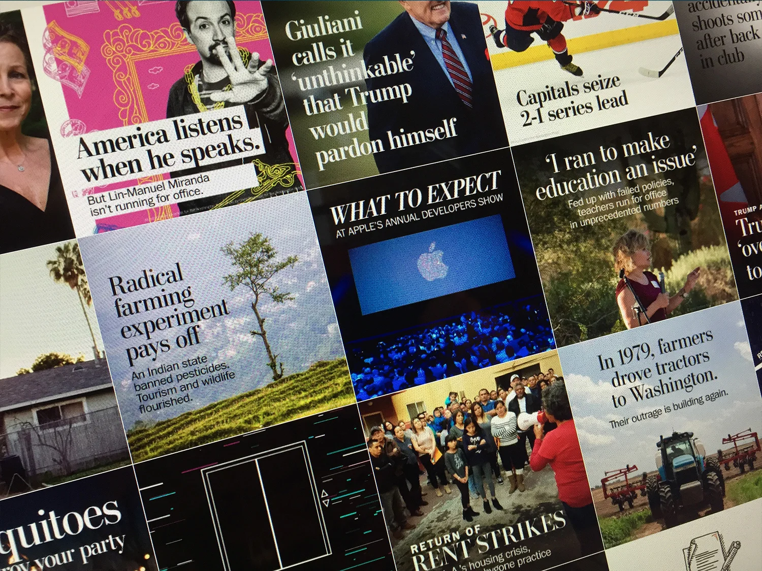
2018 / The Washington Post app, known internally as Rainbow, was one of a suite of apps for national and international news coverage. Rainbow was a highly visual experience with a streamlined design that allows users to easily navigate through the days top stories.
The redesign shown below had been proposed as a complete rebuild and received buy-in from across the organization, from the newsroom to the executive board. The new design amplified the visual experience from the first generation app while greatly improving on many of the editorial and usability concerns that had consistently received negative feedback from users. The new app focused on layering stories and pacing with better content heirachy and wayfinding. The goal was to welcome readers to dive deeper into both individual stories as well as the breadth of journalism across sections.
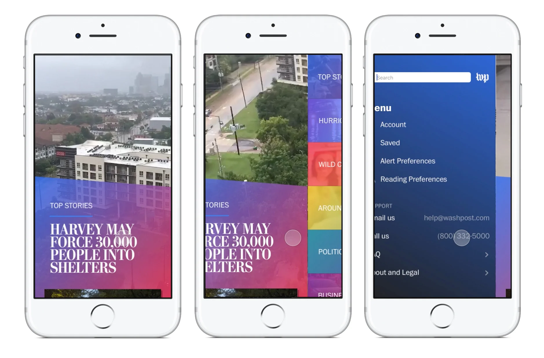
The new phone navigation design was gesture-based. This means that the reader simply swipes to navigate between the main app screens. Readers can swipe left to see the sections list or swipe right to access search, settings and other information.
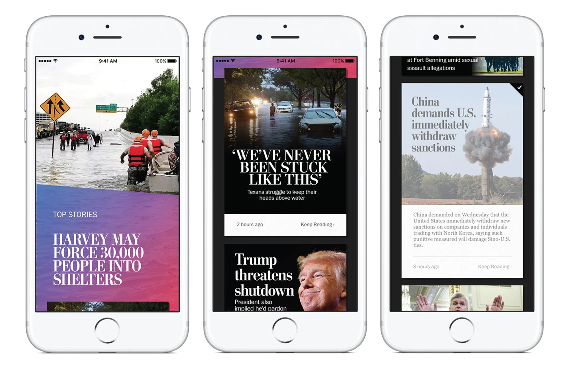
Readers are welcomed with a highly visual stream of stories. Different elements are stacked inline to allow skimming and to pace the visuals so the reader knows what is more important with large visuals and what is secondary with simple headlines.
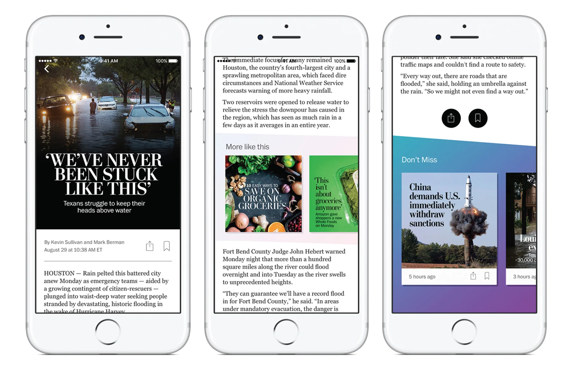
For the article experience, stories open as a layer over the current section stream, so they can always go back to the section listing with minimal effort. Stories are swipeable, as they were in the previous app, though we planned to introduce new recommendation modules within the story and at the end of a story to guide readers deeper into the content that was related or recommend based on their browsing habits.
Unfortunately, the redesign continued to take back seat to other priorities and never reached its debut.